
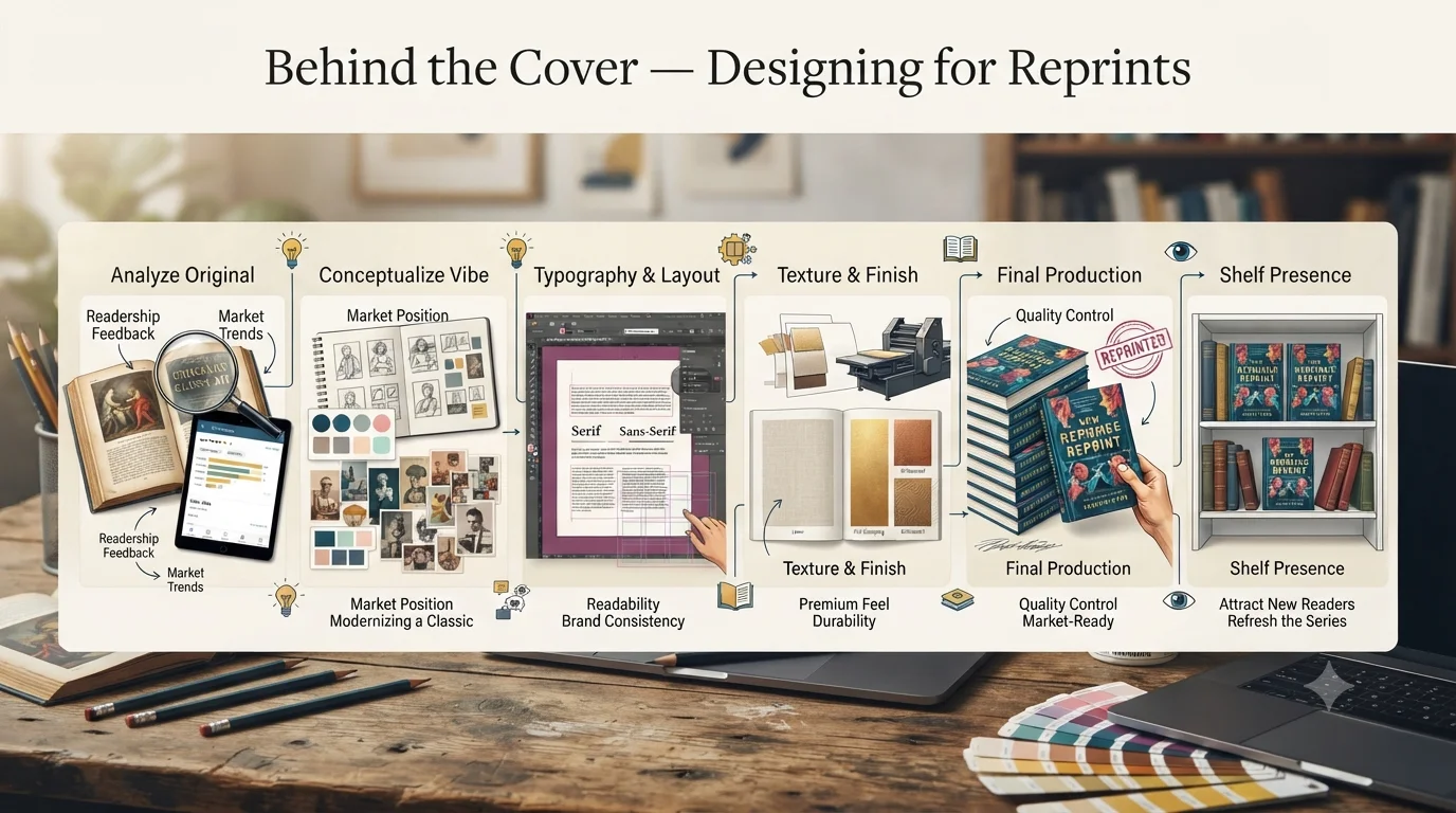
Behind the Cover — Designing for Reprints
A reprint’s cover has a difficult job: it must honour the book’s era while feeling fresh on today’s shelf. Here is how our studio approaches it.
Start with the book
Every design begins with reading — the text, its history, and earlier editions. The cover should tell a browsing reader, at a glance, what kind of book they are holding.
Typography first
Tamil script deserves type that is clear at a distance and beautiful up close. We pair a strong title face with quieter supporting type so the title always leads.
Artwork that respects the era
For classics, we draw on traditional motifs, temple art, and period illustration — reworked so they print cleanly and read well at thumbnail size online.
Materials and finish
Paper, binding, and finish matter as much as the image. A cover that survives years of handling is part of the design.